This project emphasized inclusive design as key to building a risk assessment tool and an accessibility guide to inform future FINRA tools.
Role
Lead User Researcher
Responsibilities
Secondary Research, Survey, Interview, Affinitization, Userability Testing, Sensory Cue Workshop, Co-creation Workshop, Model Experience Wheel, User Journey Mapping, Wireframing
Tools
Figma
Figjam
Maze
Team
19 Designers from
8 Majors
Duration
10 weeks
Project under NDA, Details Obscured
The contents of this project are protected by an NDA. Feel free to message me on LinkedIn to learn more.
| Context
Millions of young investors enter the market every year, but most are flying blind. Think crypto hype, meme stocks, or sketchy Reddit tips. FINRA, the US regulator for brokerages, wanted to step in and help new investors stay informed instead of getting scammed.
My team and I built an end-to-end risk assessment tool (desktop and mobile) and an accessibility guideline website to inform future FINRA tools. After using this portal, investors indicated increased knowledge on investments. Additionally, employees recorded improved efficiency and lower onboarding time while designing accessible tools for FINRA.
FINRA's Goal
Make financial literacy feel like a friendly push, not a lecture. Turn dry regulations into a tool real people actually use.
Problem
-
7 in 10 Gen Zs fear financial scams.
-
50% think investing info is full of jargon.
-
Trust drops by 60% if a tool feels corporate.
Impact
Users spent 3x more time exploring modules than standard info pages
Projected to save ~$60K–$75K in engineering costs over the product lifecycle.
Cut compliance audit preparation time by up to 40%.
My contribution
Led research for a 10-person team, designing guides, collecting 109+ surveys in 48 hrs, and defining 3 user archetypes.
Analyzed 2,000+ data points and built an experience wheel to drive ideation.
Led user testing workshop with Maze, focusing on sensory cues and WCAG accessibility.
Co-designed concepts, mid-fi wireframes, and 10 hi-fi desktop and mobile screens.
Key Takeaways
1. Led end-to-end research efforts, from survey design to user interviews and data analysis, shaping a user-centered approach grounded in real insights.
2. Strengthened my ability to align user needs with design goals, helping craft a financial tool that balanced intuitive UX with complex user scenarios.
3. Built experience in collaborative leadership, leading a team of 10 designers through research synthesis, ideation, and testing while fostering a shared design vision.
5. Learned to translate research insights into strategic design decisions, using user archetypes, experience wheels, and affinity mapping to drive concept generation.
| The Approach
8 Interviews and 109 Survey Responses
I conducted secondary research, primarily focusing on investment, investment risk, customer behaviors, and industry trends. My objective was to comprehensively understand both the emotional and cognitive barriers that new investors encounter and the challenges they face in accessing and comprehending financial tools.

109+ survey responses in 48 hours
Analyse 2,000+ data points and create model experience wheel

2000 data points collected
GOAL:
-
Proof the tool isn’t just ads for big banks.
-
Simple, non-judgey language.
-
Transparency on what’s legit vs. sketchy.
We learned that clear standards, simple language, and accessibility are key to reaching diverse users. Using these insights, we built an inclusive design strategy and created an experience wheel to align the product with user needs and motivations.
To ground our work in genuine user requirements, we successfully conducted 10 usability tests and facilitated a sensory cue workshop. These sessions enabled us to gain insights into how users interpret content, navigate interfaces, and respond to visual, auditory, and interaction cues.

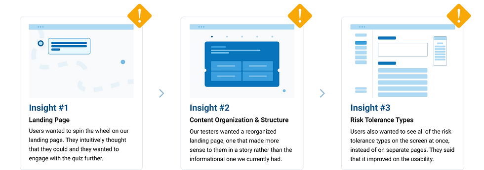
A/B Testing Insights


A lot of mobile and webpage iterations later...


Clear nav
Interactive spin-the-wheel
UI aligning to WCAG 2.1 AA Standards
Simple onboarding
Introducing an interactive
Risk Tolerance Quiz
1- Accesible landing page
2- Simple microcopy


3- Intuitive interactions


With Accessibility Team
We worked closely with our internal accessibility team to make sure all the design solutions met the latest accessibility standards. Their expertise and guidelines were super helpful in making sure the experience was inclusive for everyone, both visually and in terms of how it works.
Collaboration
With the Client
We collaborated closely with FINRA’s internal stakeholders, whose ongoing feedback helped guide our design decisions to align with both organizational goals and user needs.
In the later stages, stakeholder input on our mid-fidelity prototype revealed a preference for a more traditional and trustworthy visual style, consistent with FINRA’s brand. While this contrasted with some user insights, we facilitated a dedicated session to present two design directions—one based on brand expectations, the other on user-centered research. This open dialogue led to a refined, aligned design strategy, which was positively received during the final presentation.
Click here
| Reflection

Evidence-Based Design
The iterative testing and prototyping process gave stakeholders confidence in the solutions we proposed, while also aligning internal teams around user-validated design choices.
Inclusive Experience
Our approach aimed to reduce barriers for novice or underserved users and enhance the clarity and approachability of the overall user experience.
Scalability
The insights and design frameworks we developed laid the groundwork for more accessible and consistent experiences across future tools and platforms.
Curious how I turn complex data into simple trust? Let’s talk.
The contents of this project are protected by an NDA. Feel free to message me on LinkedIn to learn more.
